

Your restaurant’s menu is one of the first things your guests will interact with, sometimes before a cashier or server and always before the food. That’s why it’s crucial to make sure your menu makes an outstanding first impression.
A menu with too many items, poor wording, bad photos, or incongruous design will detract from a diner’s experience, putting pressure on your food and service to make up for it. A curated menu that fits seamlessly with your brand, uses photos sparingly, and puts an emphasis on both words and design will make your guests feel like they’ve chosen the right restaurant.
A thoughtfully designed menu can also make a significant impact on revenue by drawing attention to profitable menu items and leaving a lasting impression with guests.
While it’s tempting to focus on what looks pretty, menu design is only effective if you’ve already analyzed your food cost and the profitability of your menu items. Take that data and use it to your advantage when designing your menu.
These eight menu design tips will help you make strategic decisions about how your menu should look. Get inspired, and keep in mind that your design should be customized to fit your restaurant’s individual brand and personality.
1. The Golden Triangle
Menu engineering specialists say that our eyes typically start in the middle of a page, then move to the top right, then top left.
Tip: Consider putting high-margin dishes at the center and upper-right corner of your menu.
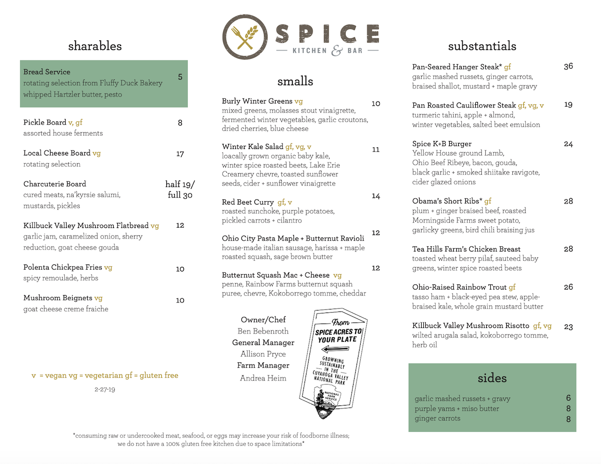
Spice Kitchen & Bar in Cleveland, OH places the most expensive item on the menu — the hanger steak — in the top-right corner. A couple of other things make this menu shine, too: the use of a few pops of color to draw attention to the cheap items, and the subtle labeling of items according to the allergens/dietary restrictions they can accommodate.
Spice Kitchen & Bar in Cleveland, OH places the most expensive item on the menu — the hanger steak — in the top-right corner. A couple of other things make this menu shine, too: the use of a few pops of color to draw attention to the cheap items, and the subtle labeling of items according to the allergens/dietary restrictions they can accommodate.
2. Use White Space
Studies show that use of white space improves reader comprehension by up to 30%. If you want your menu to leave a lasting impression, plan to incorporate negative space into your menu design.
Tip: Leave some negative space to improve aesthetics and ensure the guest isn’t overwhelmed.
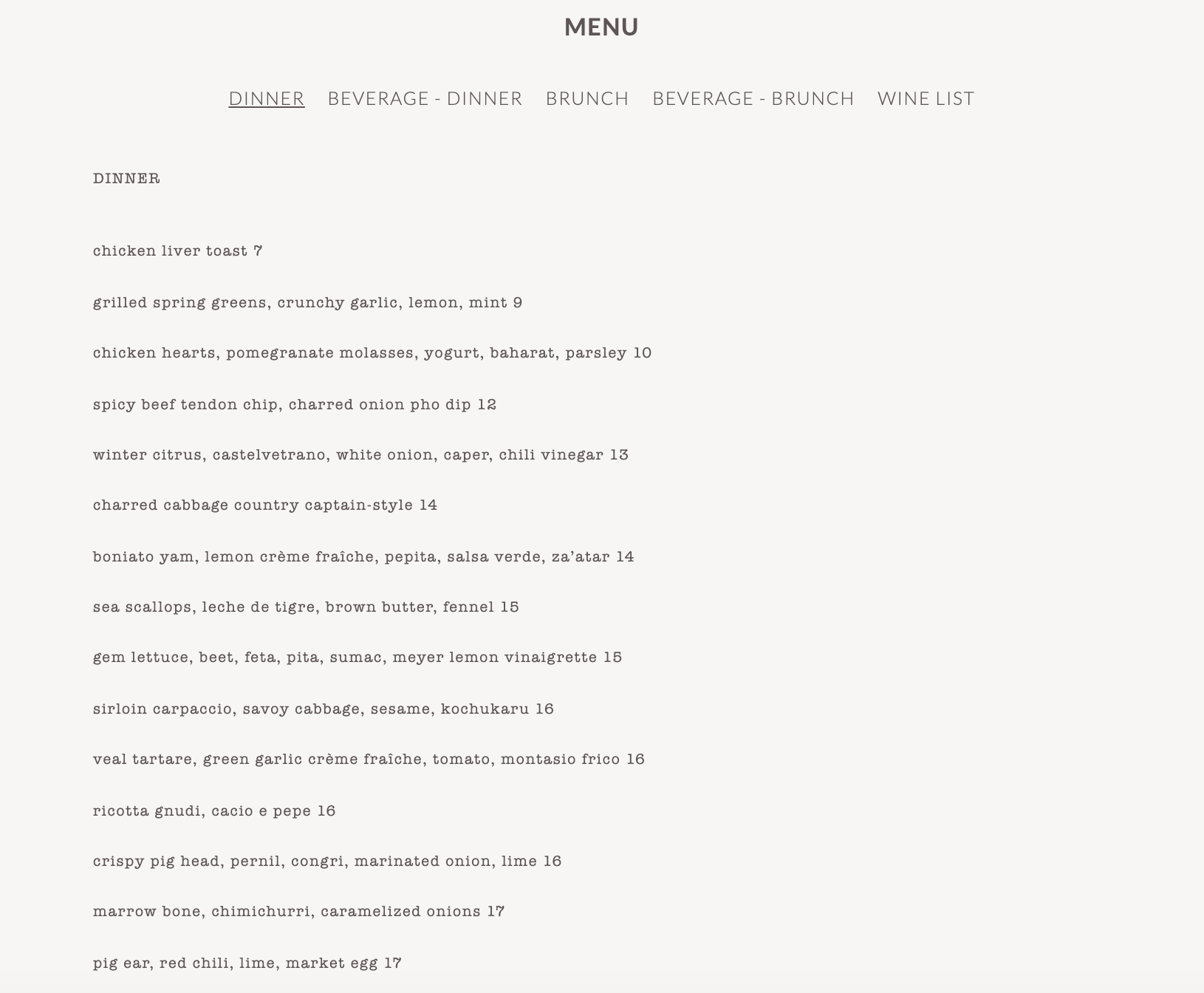
Animal, in Los Angeles, CA, uses a minimalist menu that lets the elaborate ingredients in each dish shine. They also incorporate tip #4 below: The prices are listed without a dollar sign ($).
3. Give Visual Direction
If something’s important, highlight it! Walk your guests through your menu using design elements that put the spotlight right where they should be looking.
Tip: Use boxes, lines, and color to attract attention to your high-margin menu items.
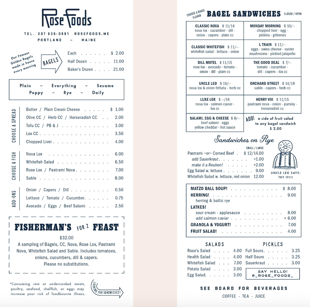
Rose Foods in Portland, ME is known for their aesthetic, and their menu is no exception. It’s double-sided, printed on heavy, light pink cardboard. They use arrows, boxes, tables, and even a small illustration to make a memorable menu that points you to the classics but also highlights big-ticket items like the Fisherman’s Feast.
4. Show off Your Value
Don’t lose sight of the fact that your menu is a direct reflection of your restaurant’s pricing strategy and brand. If low prices and great value are an important part of what makes your restaurant stand out, use your menu to convey that message.
Tip: Highlight economic value by enlarging prices and/or highlighting combos.
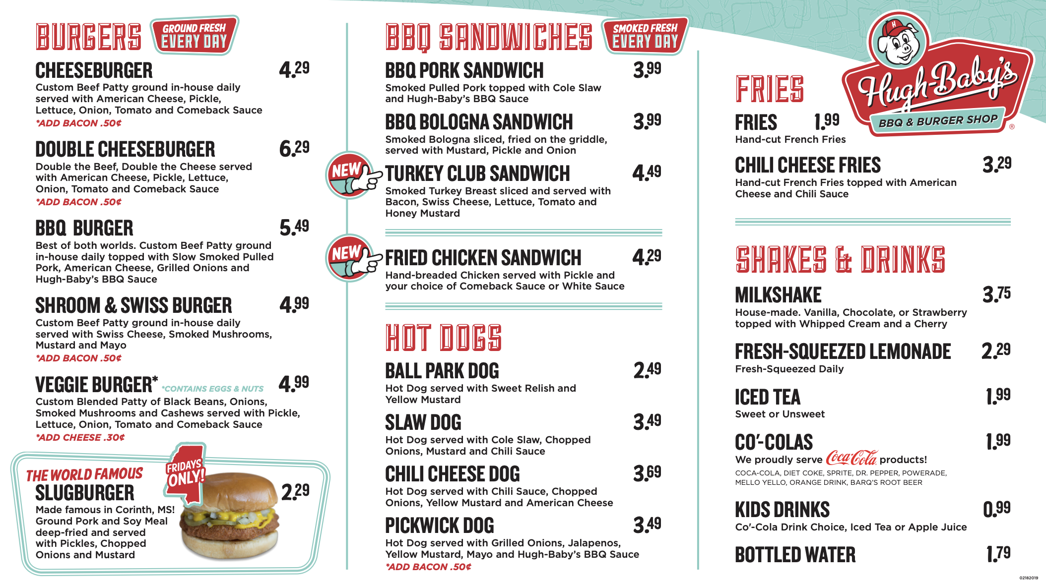
Hugh-Baby’s, a Nashville, TN local chain, has their low prices featured in large, bold font all over the menu, and it’s a big draw for diners. The vintage, cartoonish aesthetic also matches the fast-food vibe of the restaurant.
5. The Burden of Choice
A study at Bournemouth University found that there’s a sweet spot between too few and too many menu choices. Diners are already overwhelmed with choosing where to eat. Once they’ve settled on your restaurant, don’t make them sift through hundreds of options.
Customers like to see 6 items per category in fast food shops and 7-10 items for fine dining restaurants.
Tip: Match the length and options on your menu to your customers’ expectations.
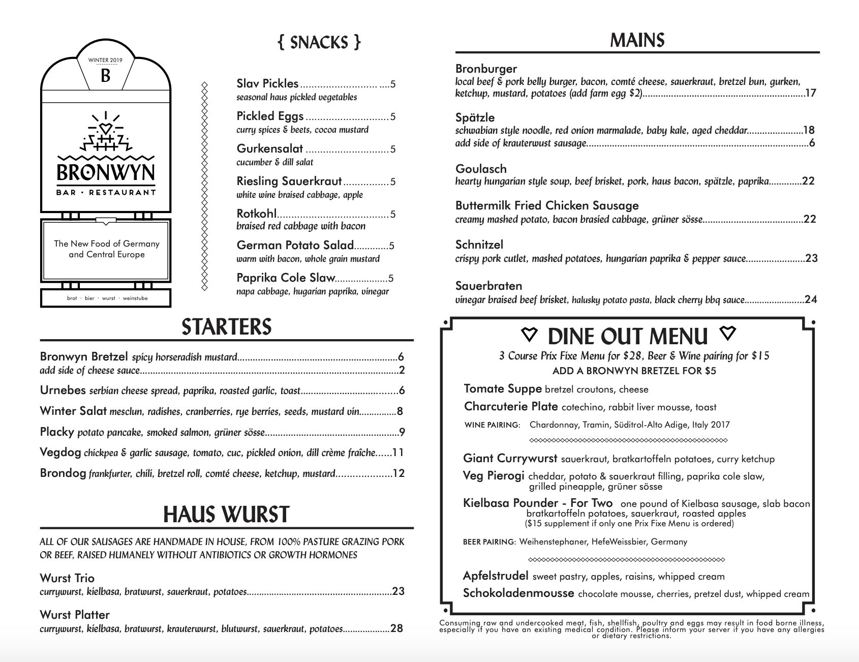
Bronwyn, a German bar in Somerville, MA, is a casual bar and restaurant with high-quality food, and the number of menu options reflects that. It’s curated but with options for almost any diner. It also uses boxes and other design elements to direct the eye.
6. Carefully Select Pictures
Renowned menu engineer Gregg Rapp found that including a nice-looking picture alongside a food item increases sales by 30 percent. A word of caution, though: Don’t use mediocre photos on your menu. Better to use no photos than bad photos.
Tip: Especially on digital menu boards, consider using high-quality photos of high-margin items to entice diners.
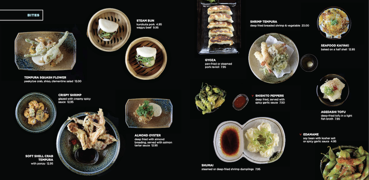
At Douzo Sushi in Boston, MA, the whole menu is showcased with high-quality photographs set on a black background. It’s visually exciting and can get diners to order something they’ve never had before.
7. No Pictures? Use Imagery With Words
Use menu item descriptions to communicate the taste of a dish. Words like “savory,” “buttery,” and “crisp” elicit a visceral reaction. Use descriptions to convey the restaurant’s personality and wake up your guests’ appetites.
Tip: Using highly descriptive language when copywriting your menu makes your guests feel something when they read it.
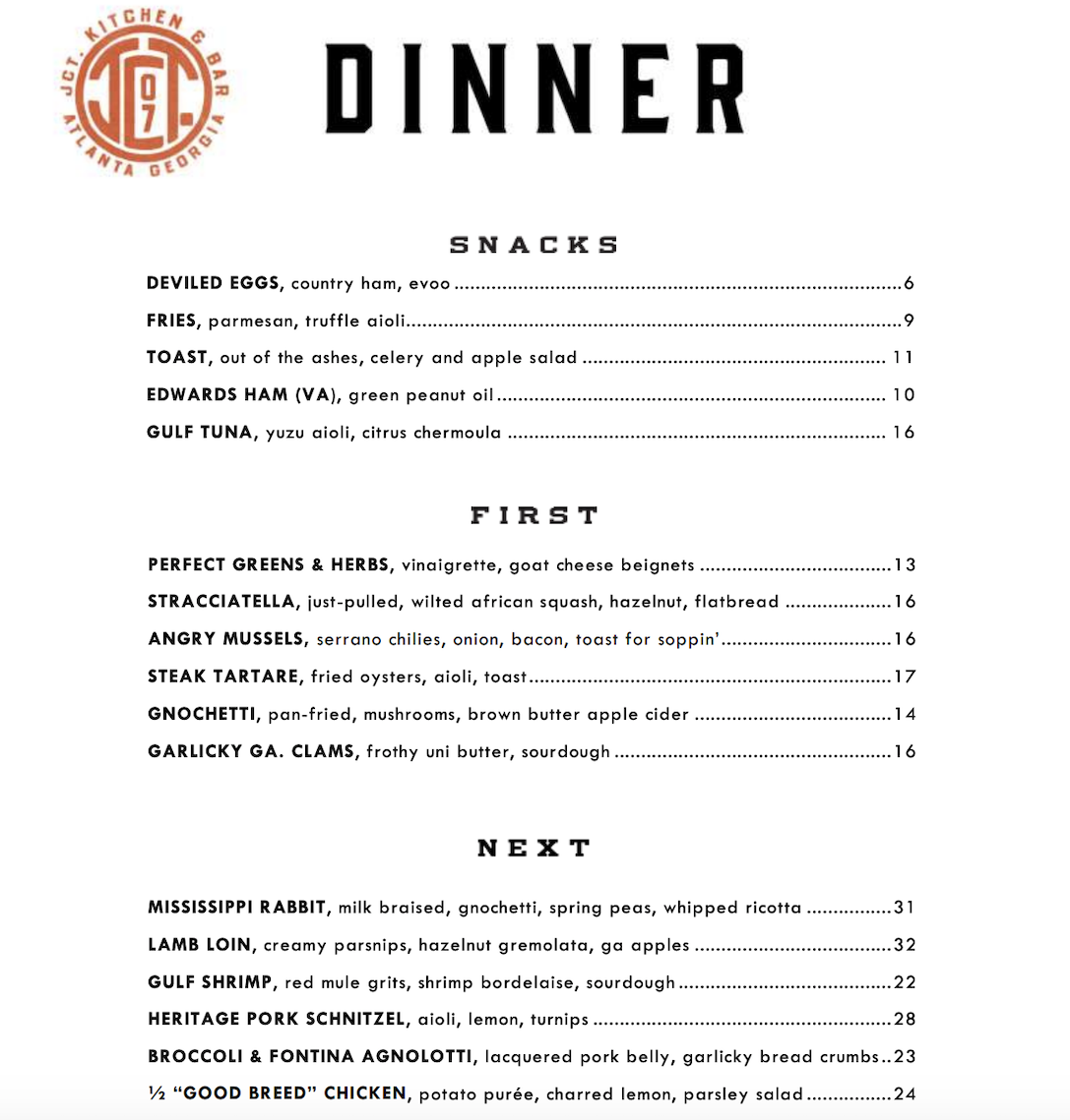
JCT Kitchen in Atlanta, GA does an outstanding job using vivid, descriptive words without veering into cheesy territory. “Toast, out of the ashes,” “just-pulled, wilted African squash,” “frothy uni butter,” and “lacquered pork belly” are all great examples.
BONUS TIP: Get Creative and Work With an Artist
If you’re able to, hiring an artist to illustrate your menu items can be a great way to make sure your brand sticks with a diner.
Tip: Find an artist or graphic designer who can help you develop your brand and make your menu stand out.
Bucktown, in Providence, RI, incorporates fun fonts and illustrations all over the menu. The sandwich column is especially memorable, with all the options sitting between a top and bottom bun.

Content source – Toast


